Strong customer authentication
Security verification in banking
Sprint
8 weeks
Team
Myself (UX Designer), UX researchers, UI Designer and Product Manager.
My responsibilities
I worked with a UI designer who had already designed the journey and provided a new user journey and solutions on how to handle unhappy paths.
What is SCA?
Strong Customer Authentication (SCA) are rules set in the Payment Services Regulations which have taken effect from 14th September 2019.
Banks and payment services providers must implement a method for users to validate they are authorized to make payments or access their payment account.
The rules are required to take place when the payer:
Initiates an electronic payment transaction
Accesses their payment account online
Carries out any action remotely that may imply a risk of payment fraud.
My process
Identify how users are to authenticate themselves. Users are required to verify themselves on the web console when engaging with payments related information.
They can verify in two ways:
- Open the mobile app if the push notification is present or enter the approval center within the app.
- Enter text code sent by SMS.
We discovered the user will need to validate their permission to:
- Log into Soldo for the first time, past 90 days the user will need to reauthenticate.
- View card number and pin numbers.
- View report transactions past 90 days.
- View report statements past 90 days.
- Export reports
- Order new cards
The unhappy paths
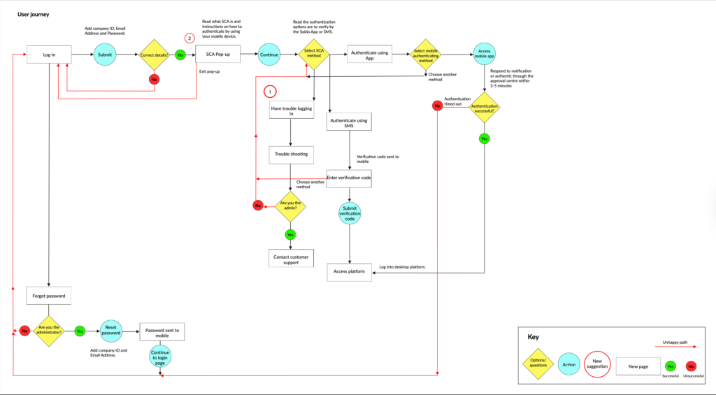
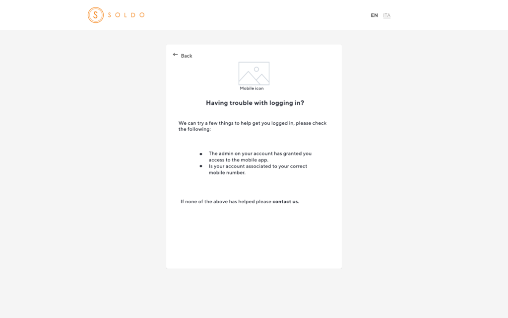
‘Having trouble logging in?’
Identified a usability issue where non-admin users experienced a login loop due to unclear guidance around admin only support. The existing copy implied that only admins could contact customer support, leaving users unsure of their role or how to identify their admin.
I collaborated with customer support to understand common user enquiries and confirmed that support could assist non-admin users in identifying their admin, provided no restrictions were in place.
Based on these insights, I improved the login experience by:
Updating copy to clearly indicate that support is available to all business users (“Still having trouble? Contact us.”)
- Adding a link to the mobile app with a visual guide to help users download the correct app and complete authentication
- These changes reduced confusion, prevented login dead-ends, and helped users resolve access issues more quickly.
‘Don’t have the app?’
During analysis of the Strong Customer Authentication (SCA) flow, I identified a drop-off point at the SCA pop-up. Users were abandoning the journey because they either didn’t have the mobile app installed, hadn’t fully read the instructions before continuing, or felt uncertain about starting a new process without knowing how long it would take.
This lack of clarity created hesitation and prevented users from completing authentication.
To reduce friction and set clearer expectations, I redesigned the SCA pop-up by:
- Adding a prominent link to download the app (“Don’t have our app? Follow this link”) to immediately support users without it
- Introducing a progress bar to communicate how many steps were involved and how long the process would take
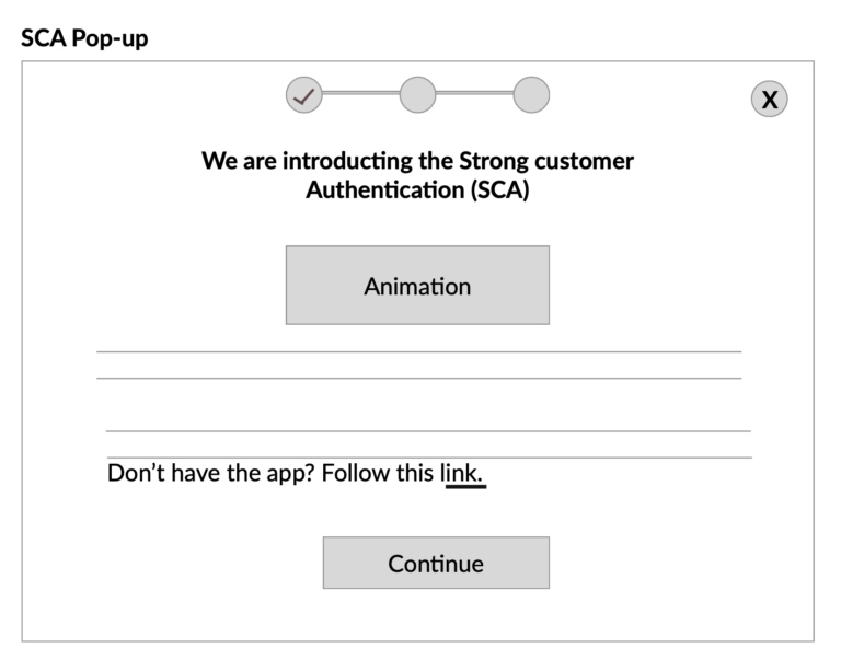
Outcome
These changes reduced uncertainty at a critical decision point, helping users feel more confident continuing with SCA and improving completion of the authentication journey.